Artwork and Interiors: How to Choose and Place Art With Confidence
Art is often the last thing to go into a room, and the first thing people notice. It is also the part of a project clients feel least sure about. What should I buy? How big should it be? How high should it hang? Most of the hesitation comes from worrying about getting it wrong, and the result is a room with bare walls, or a piece bought because it matched the cushions.
Choosing and placing art is less about rules and more about a few principles. Get these right and your walls start doing some of the work for you.
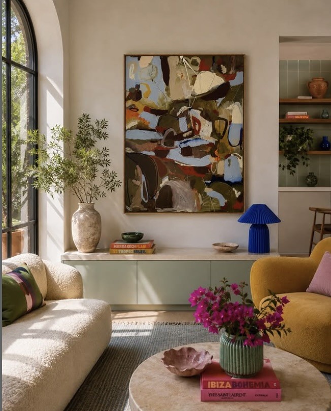
A generously scaled abstract gives this living room its hero piece, and picks up the colours of the room without matching them. Image via Greenhouse Interiors.
Start With How You Want the Room to Feel
Before you look at a single piece, think about the mood of the room. A calm bedroom calls for something quiet and restful. A living room where you entertain can carry more colour, more energy and more scale. Art sets the tone of a space faster than almost anything else, so decide on the feeling first and let that guide what you look at.
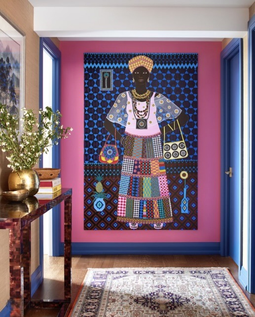
A large-scale work by Carla Kranendonk brings colour and energy to this entry. Image via Carla Kranendonk Artist.
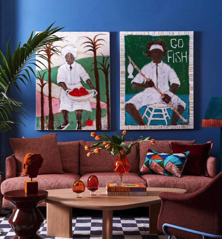
A bold pair of Kerrie Jeffs paintings gives a fabulous focal point to this space. Image via Greenhouse Interiors.
Buy What You Love, Not What Matches
The most common mistake we see is art chosen to match the sofa. It rarely works. A piece that simply repeats the colours already in the room tends to disappear into it. Buy something that moves you, and trust that a well considered room will make space for it. If a piece picks up one or two tones from the scheme, that is enough to connect it. It does not need to match.
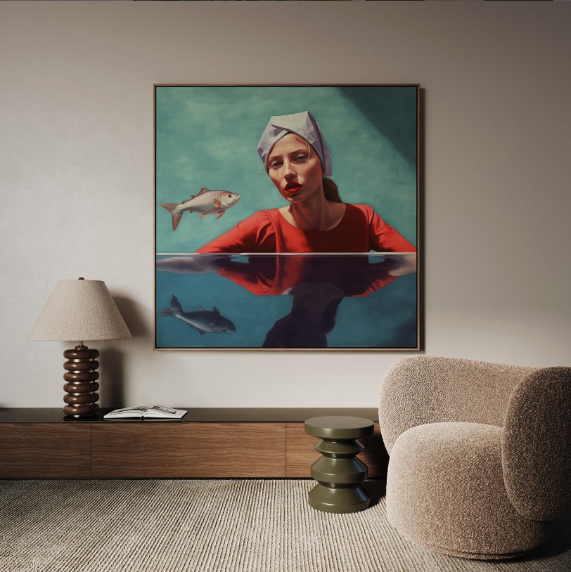
The strong red of this portrait contrasts with a quiet, neutral room, and that is what makes it work. Image via Alicia Bourley Art.
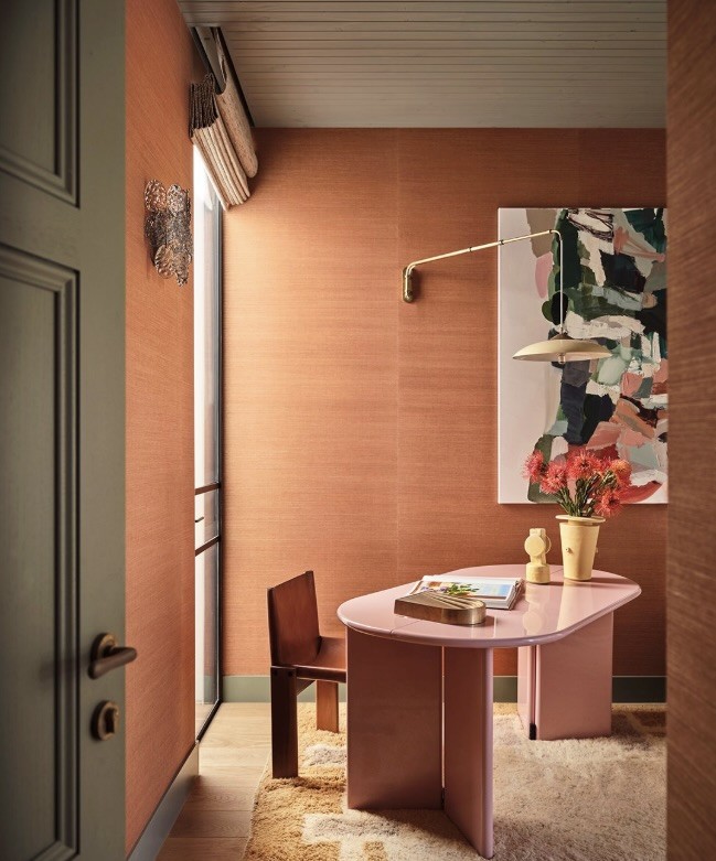
An abstract packs a punch against gorgeous terracotta grasscloth walls. Image via Jase Sullivan Design.
Art is very subjective, so give yourself time. Visit galleries, follow artists, and notice what you keep coming back to. A hero piece you love will outlast any trend.
Scale Matters More Than You Think
Most art we see in homes is too small for the wall it hangs on. As a guide, a piece above a sofa, bed or console should be around two thirds the width of the furniture beneath it. If a single piece feels too small, go bigger or group two or three works together so they read as one.
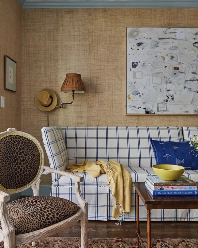
Sized to the sofa beneath it, this abstract holds the whole wall. Image via Pinterest.
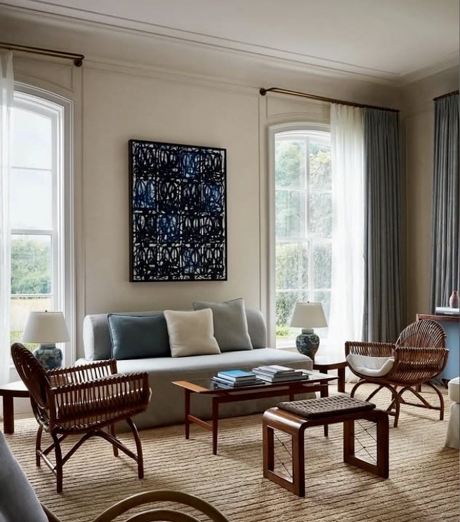
A single graphic piece, well scaled to the wall between two windows. Image via Pinterest.
On a large empty wall, do not be afraid of scale. One generous piece almost always looks more confident than several small ones scattered across the space.
Hang It at the Right Height
Art is almost always hung too high. The centre of a piece should sit at roughly eye level, around 145 to 150cm from the floor. Above furniture, leave a gap of around 15 to 25cm between the top of the sofa or bedhead and the bottom of the frame, so the two feel connected rather than floating apart.
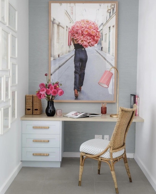
Hung close to the desk below, this oversized framed photograph reads as one composition with the joinery. Image via Carla Coulsen.
Placement: Where Art Works Hardest
Think beyond the obvious wall above the sofa. A piece at the end of a hallway draws you through the house. Art in a powder room or kitchen is unexpected and personal. Smaller works leaning on a shelf, a mantel or a console can be layered and swapped around easily, which is a relaxed way to start a collection without committing to a hook in the wall.
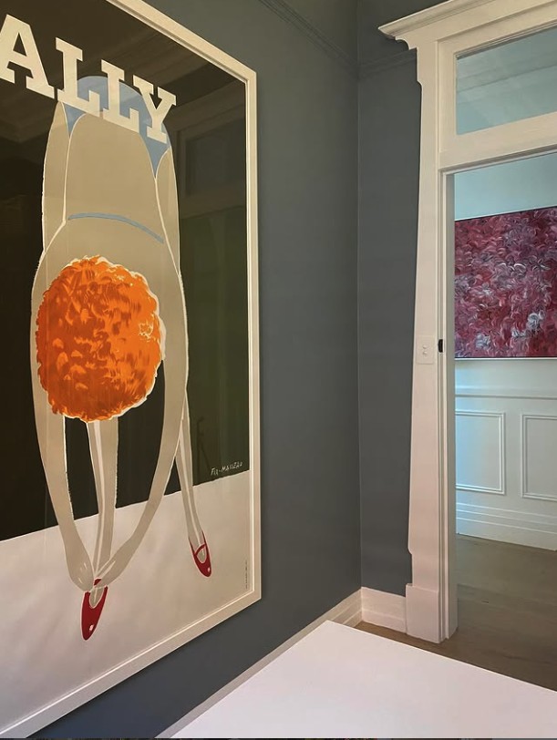
An oversized vintage poster provides a stunning contrast to the dark walls in our Mosman Federation project and leads your eye to the Indigenous artwork beyond.
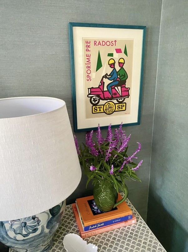
A small vintage print with a quirky frame finishes this bedside in our Mosman Federation project.
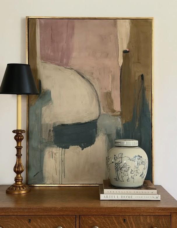
A large abstract work by Amanda Carol leaning casually on a vintage chest, layered with a lamp and ginger jar, creates a wonderful vignette.
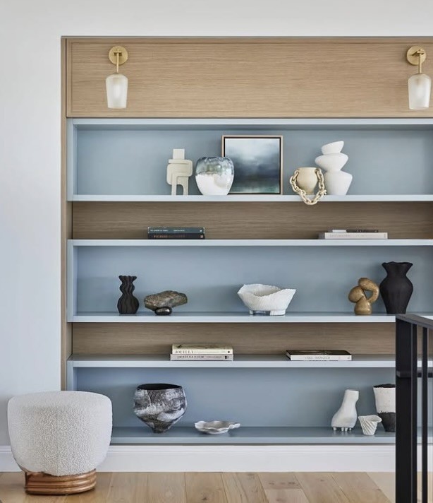
Smaller works styled among ceramics on open shelving, easy to move around. Image via Pinterest.
Grouping and Gallery Walls
A group of works can be beautiful, but it needs a plan. Lay the pieces out on the floor first, or cut paper templates and tape them to the wall, until the arrangement feels balanced. Keep the spacing between frames consistent, around 5 to 8cm, and treat the whole group as a single piece when working out its overall size and height.
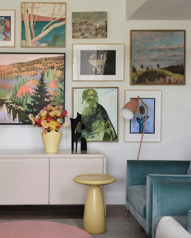
A collected gallery wall of landscapes, held together by consistent spacing in this wonderful space by Altus Design Studio.
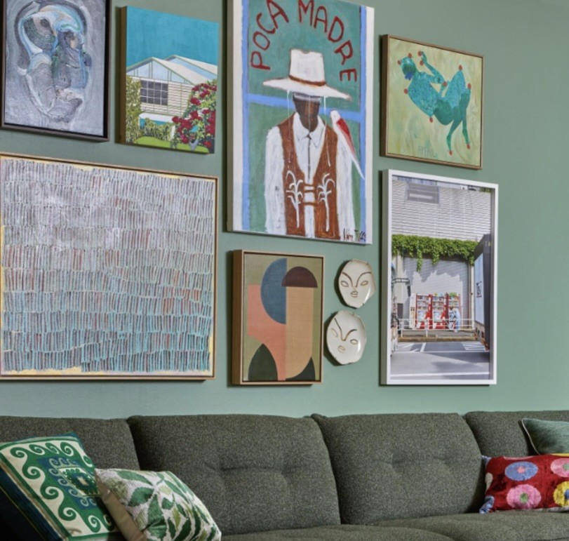
Contemporary works grouped above a sofa work together as one generous piece. Image via Greenhouse Interiors.
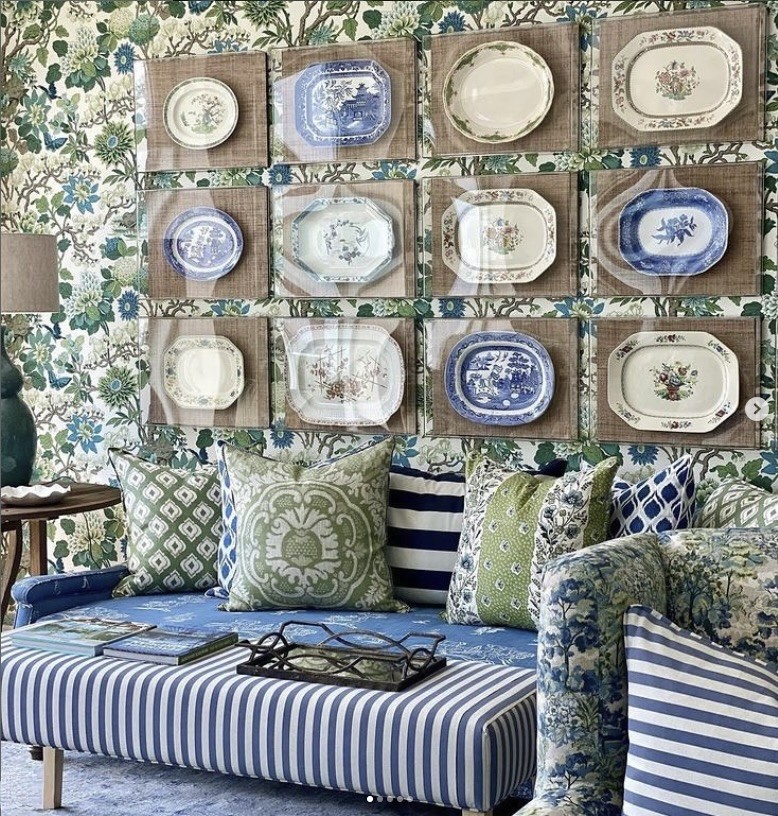
Art does not have to be framed. A fabulous collection of platters framed behind perspex and arranged in a tight grid becomes the feature wall. Image via Sue Bond Interiors.
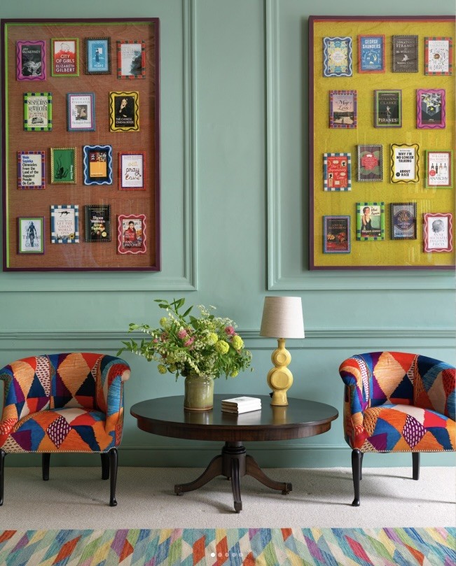
Two framed collections, balanced symmetrically either side of a panelled wall. Image via Kit Kemp Design.
Framing and Lighting
Good framing can lift a modest piece, and poor framing can let down a great one. Keep frames simple and let the work lead. A generous mount gives smaller works more presence on the wall. Lighting matters too: a picture light or a well placed downlight brings a piece to life in the evening, when most of us actually spend time at home.
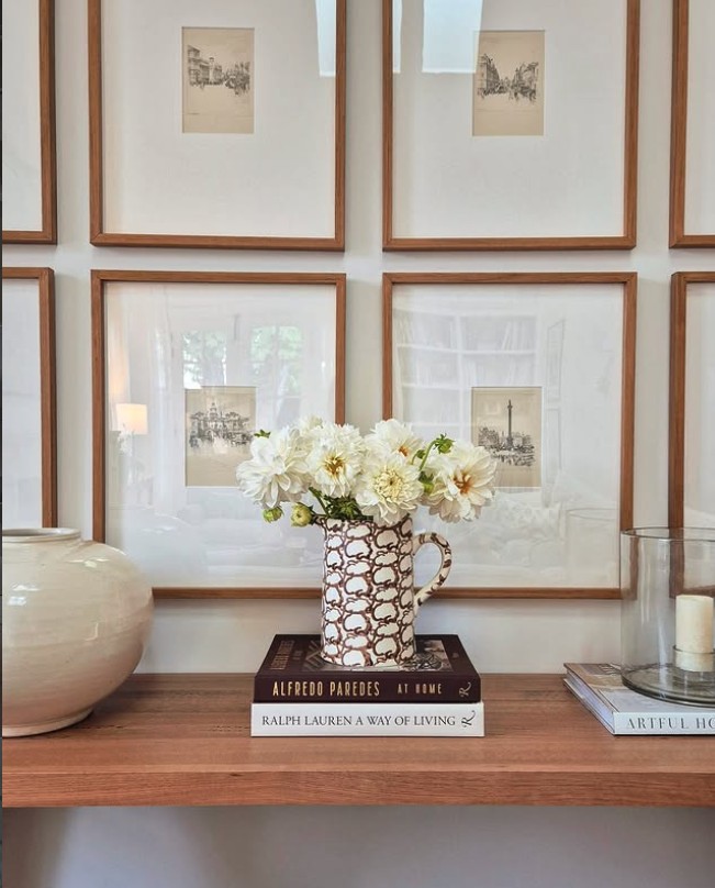
Generous mounts give these simple sketches real presence on the wall. Image via @ingridand3.
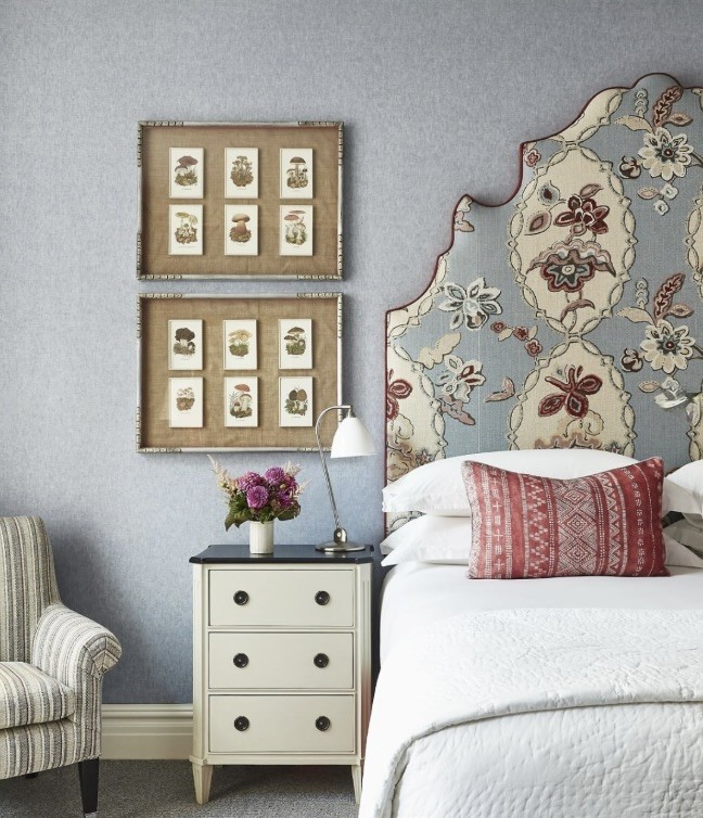
Framed botanicals with a coloured mount and a simple frame tie in with this bedroom scheme whilst providing contrast. Image via Kit Kemp Design.
Building a Collection Over Time
A collection does not need to be bought all at once. Some of the best homes we work in have art gathered slowly: a piece from a regional gallery on a weekend away, an emerging artist followed for years before buying, something inherited that has been reframed. Buy wisely, one piece at a time, and the collection becomes a record of the people who live there.
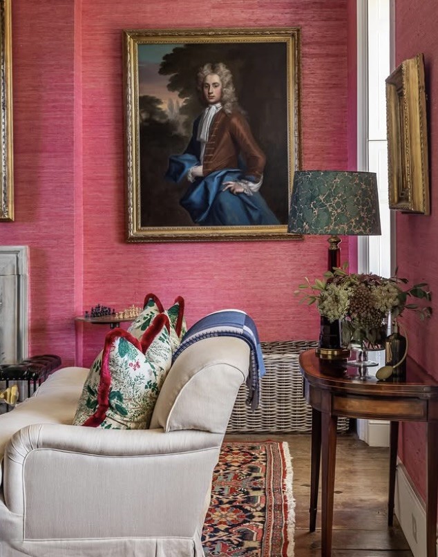
A traditional portrait against vibrant pink grasscloth, a reminder that inherited pieces can still look fabulous in a contemporary setting. Image via Todhunter Earle Interiors.
Over the years I have built my own personal collection of galleries and artists I follow, from Sydney galleries to regional spaces and individual artists worth watching. I call it The Art Edit, and I share it with clients who are starting out on their art gathering journey. If you would like a copy, simply get in touch.
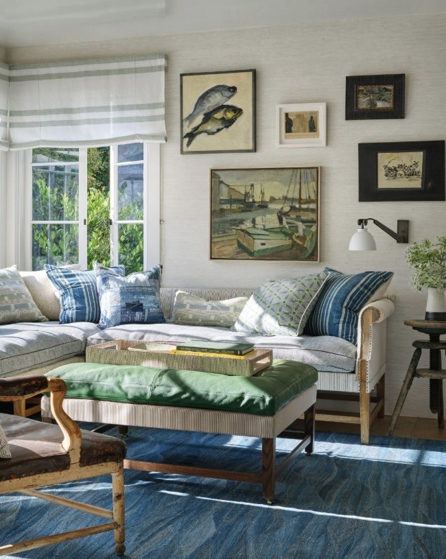
A lovely room that has been collected over time, with every piece feeling comfortable and personal. Image via Jeffrey Alan Marks.

Finish the Room With Art You Love
Get in touch and I will send you The Art Edit, my personal collection of the galleries and artists I follow. For a home finished right down to the art on the walls, our Signature Styling Experience takes care of sourcing, placement and styling from concept through to the final day.
Get in Touch