How We Look at Paint Colours for Sydney's Coastal Light
The light in a coastal property is nothing like the light in a suburban home further inland, and paint colours that can look warm and inviting elsewhere can turn cold, flat or overly bright in a coastal home. Here is how we approach colour selection for Sydney's coastal light.
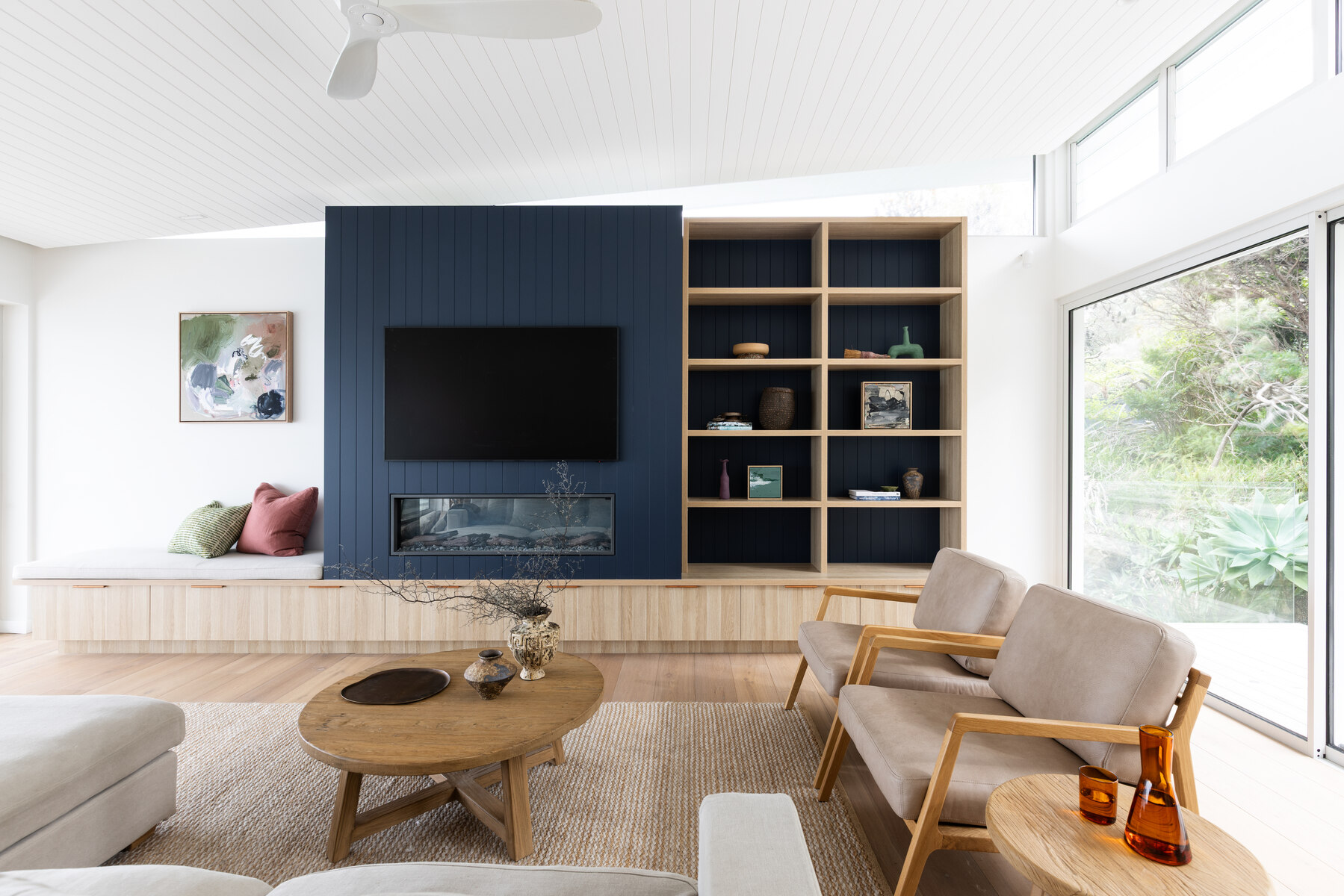
Why Coastal Light Behaves Differently
Coastal properties receive more reflected light than homes further inland, bouncing up off sand, ocean and pale hard surfaces as well as coming directly through the windows. That reflected light is brighter and often cooler in tone, which means a paint colour that looks warm and settled on a showroom swatch can read considerably starker once it is on a wall facing open water or sky.
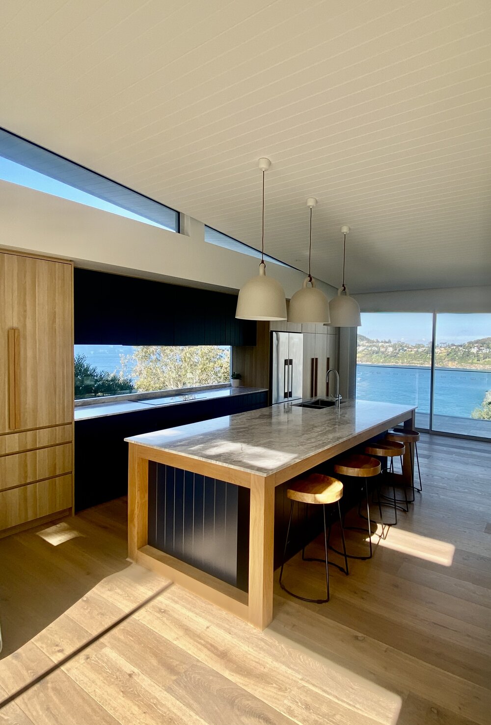
The kitchen at our Whale Beach House project with light bouncing straight off the water outside.
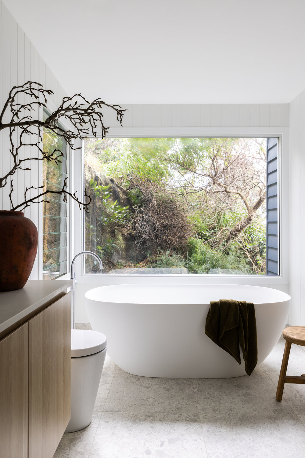
The ensuite also at our Whale Beach House project, uses exactly the same white but a different aspect filtered through the greenery gives it a softness.
Warm White or Cool White?
Given how much cool, reflected light a coastal room already receives, we lean towards paint colours with a warmer undertone as a counterbalance, rather than compounding the coolness with a stark or blue-based white. This is the same principle we cover in more detail in Not All Whites Are Equal: undertone matters more than the colour name on the tin, and a white that looks perfect in one light can look entirely different in another.
North-Facing vs South-Facing Rooms
Orientation still matters just as much on the coast as anywhere else. North-facing rooms receive warm, direct light for most of the day and can generally handle a cooler or more saturated colour without feeling cold. South-facing rooms miss out on that direct warmth and tend to need a colour with more warmth built in to avoid feeling flat, particularly in a home that is already surrounded by cool, reflective light from the water.
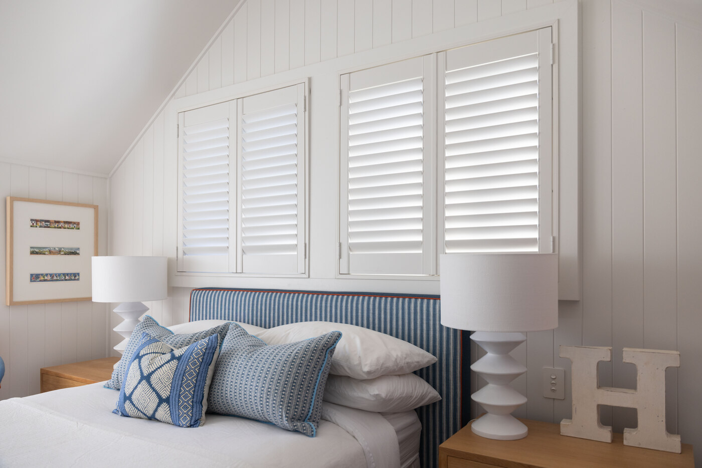
A bedroom from one of our Mosman projects, crisp white v-groove walls and plantation shutters give a warm undertone to this space.
Always Test on the Wall, Not the Swatch
This matters everywhere, but it matters more on the coast, where light changes so noticeably from morning to afternoon. Paint a sample directly onto the wall in question, not a piece of card propped against it, and look at it at different times of day before committing. A colour that looks right at midday can shift considerably by late afternoon once the light angle changes.
Our Go-To Approach
For coastal projects, we typically build the palette around warm, softly muted neutrals: close enough to white to stay calm and light-filled, but with enough warmth in the undertone to hold their own against the reflected light outside without competing with the view itself. Layered against natural materials like timber, linen and stone, the result is a home that feels considered rather than washed out by the light around it.
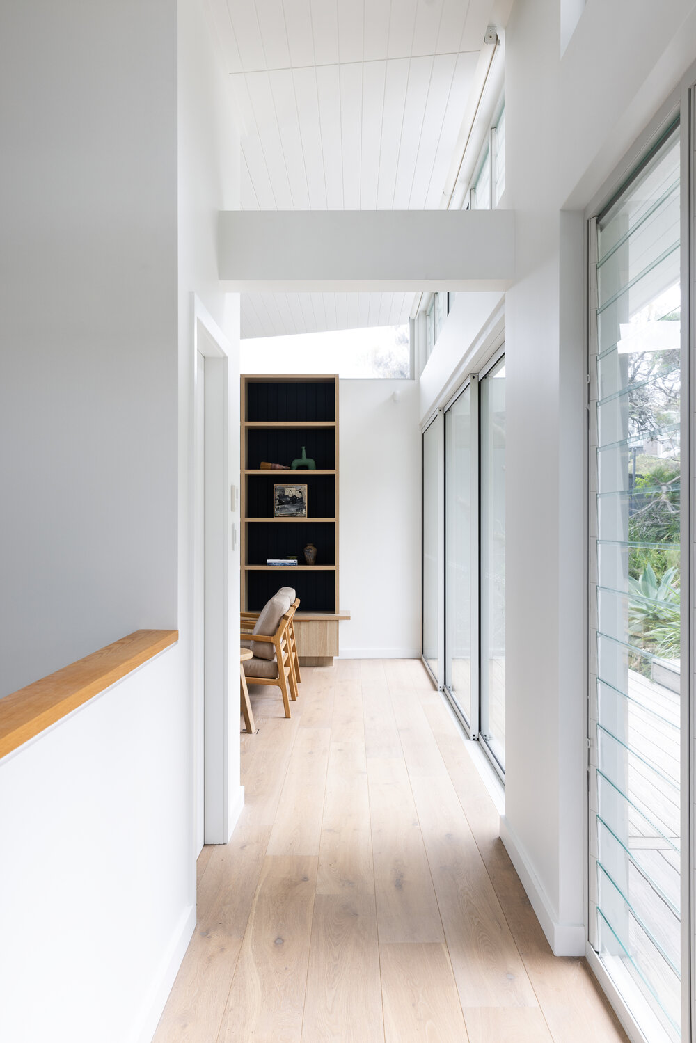
A hallway at our Whale Beach House project, where the same warm, pared-back palette carries through even the smaller in-between spaces.
See how this approach comes together in practice in our Whale Beach House renovation.

Working through a palette for a coastal home?
Our Initial Consultation includes a site visit and clear direction on colours and materials, tailored to how the light moves through your home.
Book a Consultation