Pattern With Purpose
Pattern is the decision most clients hesitate over. Paint colours feel reversible, furniture feels like an investment worth taking time over, but pattern, whether it's a wallpaper, a cushion or a piece of art, feels permanent in a way that makes people cautious. It shouldn't. Used with purpose, pattern is what makes a room feel complete.
The rooms that hold our attention longest are rarely the ones with a single statement moment. They're the ones where pattern has been layered in gradually: a striped headboard here, a hand-blocked cushion there, a collection of blue and white porcelain built up over years. Nothing competes. Everything looks like it belongs.
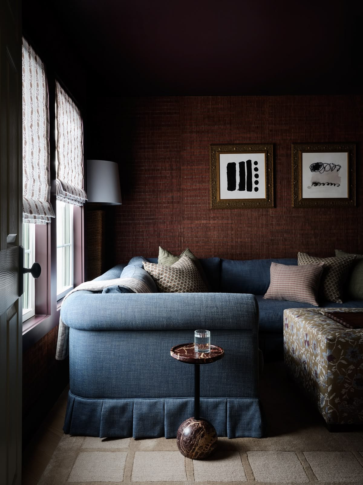
A grasscloth wall and a plain skirted sofa give this beautiful cosy room its neutral base. Pattern is added subtly via the ottoman, blinds and cushions. All adding a layer of detail and interest to this moody scheme. Design: Anastasia Casey for The Interior Collective
Start With a Base, Not a Statement
Before any pattern enters a room, we settle the base: wall colour, joinery tone, the flooring underfoot. In the room above, the grasscloth wall, dark ceiling and plain skirted sofa all form a base, so the room already feels resolved before the layers are added. That restraint at the base is what allows pattern to be introduced later without the room looking cluttered.
Layer Through Textiles First
Textiles are the most forgiving place to begin, because they can be edited without touching the bones of the room. A striped linen headboard paired with a folk-patterned wallpaper works because the scale of each pattern is different: one is a small, regular repeat, the other a looser hand-drawn motif. The same idea holds at bedside scale, a leaf print on the headboard, a soft check on the lampshade, a geometric on the cushion, provided each pattern shares a colour thread and varies in scale, so the eye has somewhere to rest between each one.
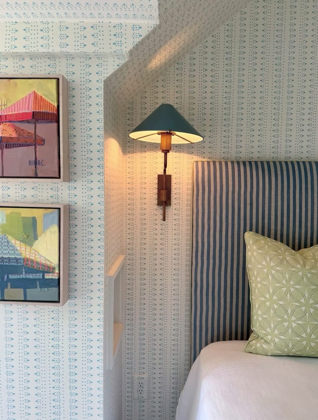
Striped linen against a small-scale block print wallpaper, two patterns that never compete for attention. Image via Pinterest.
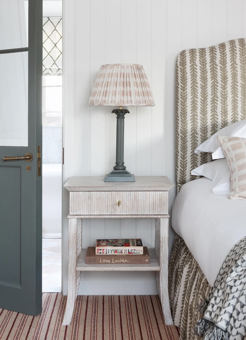
The same idea at bedside scale: a striped leaf print on the headboard, a soft check on the lampshade, a geometric on the cushion and a striped rug all working in harmony. Image via Pinterest.
Let Collections Do the Work
Pattern doesn't only arrive as fabric. As shown here in our Mosman federation project, a collection of blue and white ginger jars, built slowly rather than bought in a single order, reads as pattern too, repeated form, endless variation within it. These collected moments are often what give a room its sense of history, and they're worth designing shelving around rather than treating as an afterthought once the joinery is finished.
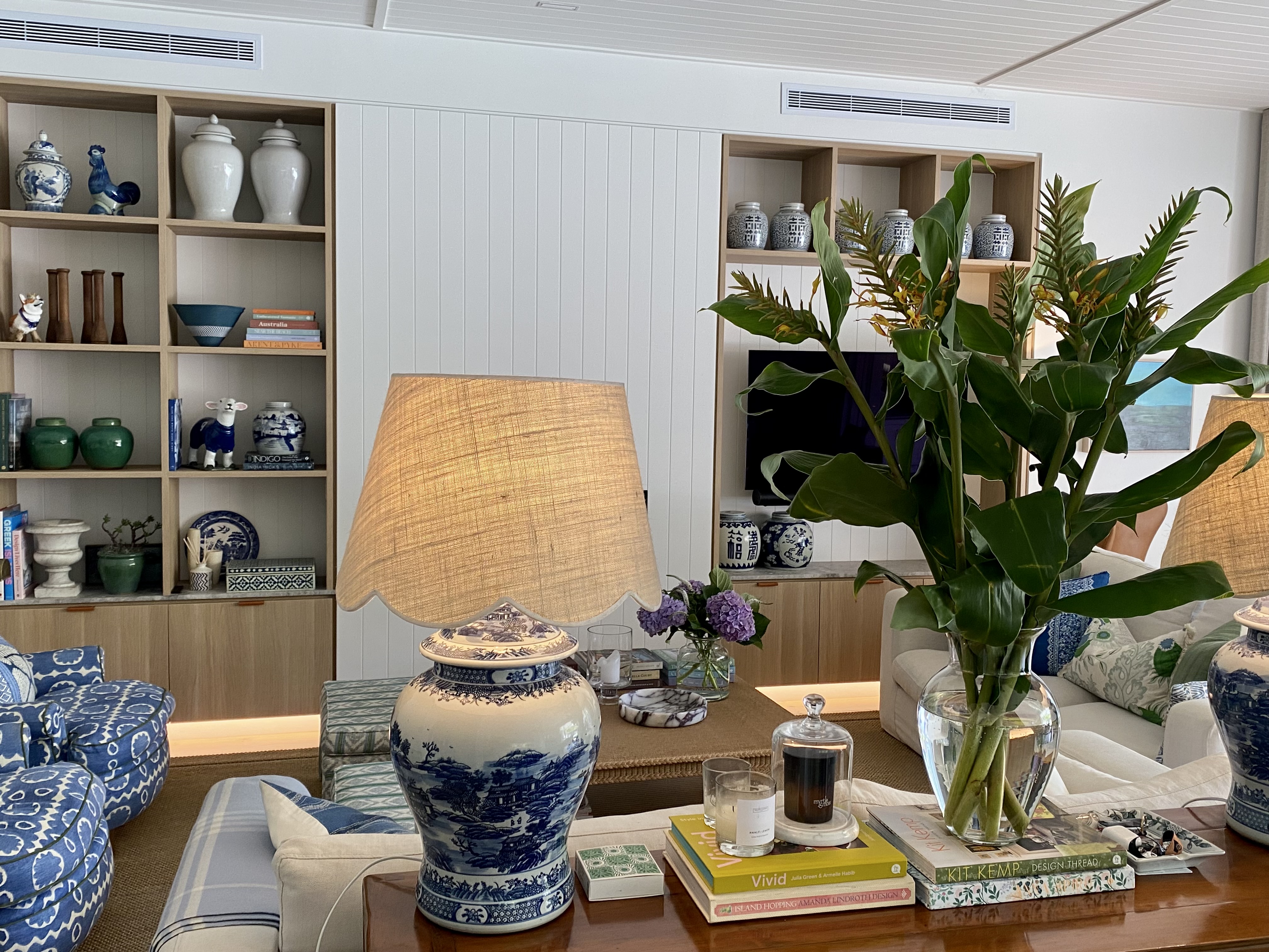
Open shelving styled to let a collection of ceramics and treasured items read as its own pattern within the room.
A gallery wall works on the same principle. Different frames, different subjects, even different eras, but hung together they read as a single considered pattern rather than a scattering of individual pieces. The trick is consistency somewhere else in the room, a neutral wall, a quiet sofa, so the wall has room to do the talking.
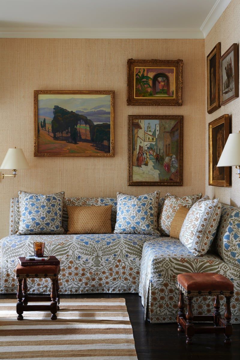
An all-over floral on the sofa and a gallery wall above it, held together by the same warm grasscloth background. Image via vanderwallinteriors.com
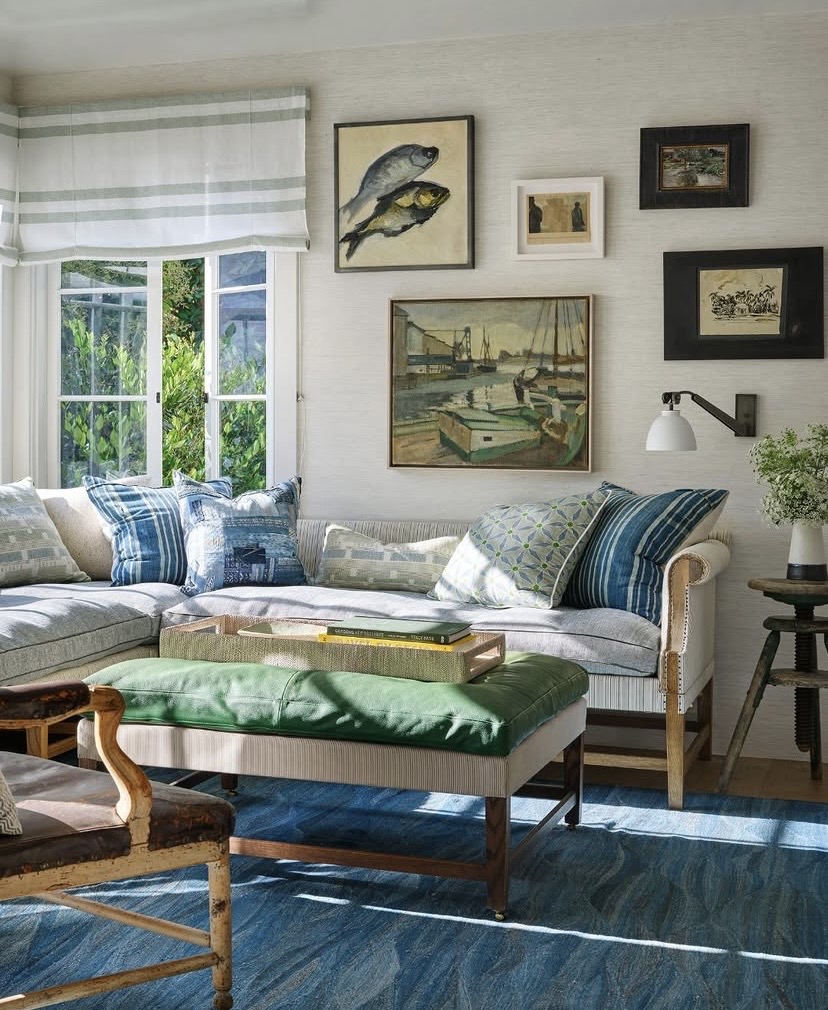
A quieter version of the same idea: neutral linen and grasscloth let a mixed gallery wall carry all the pattern. Image via Pinterest.
Pattern Doesn't Stop at Eye Level
It's easy to think of pattern as something that happens on walls and sofas, at eye level. Some of the most successful rooms we style put just as much thought into the floor. As shown in this bathroom by Arent&Pyke, a hand-blocked wallpaper paired with a patchwork terracotta tile works because the two patterns operate at completely different scales and heights, one is read up close underfoot, the other from across the room.
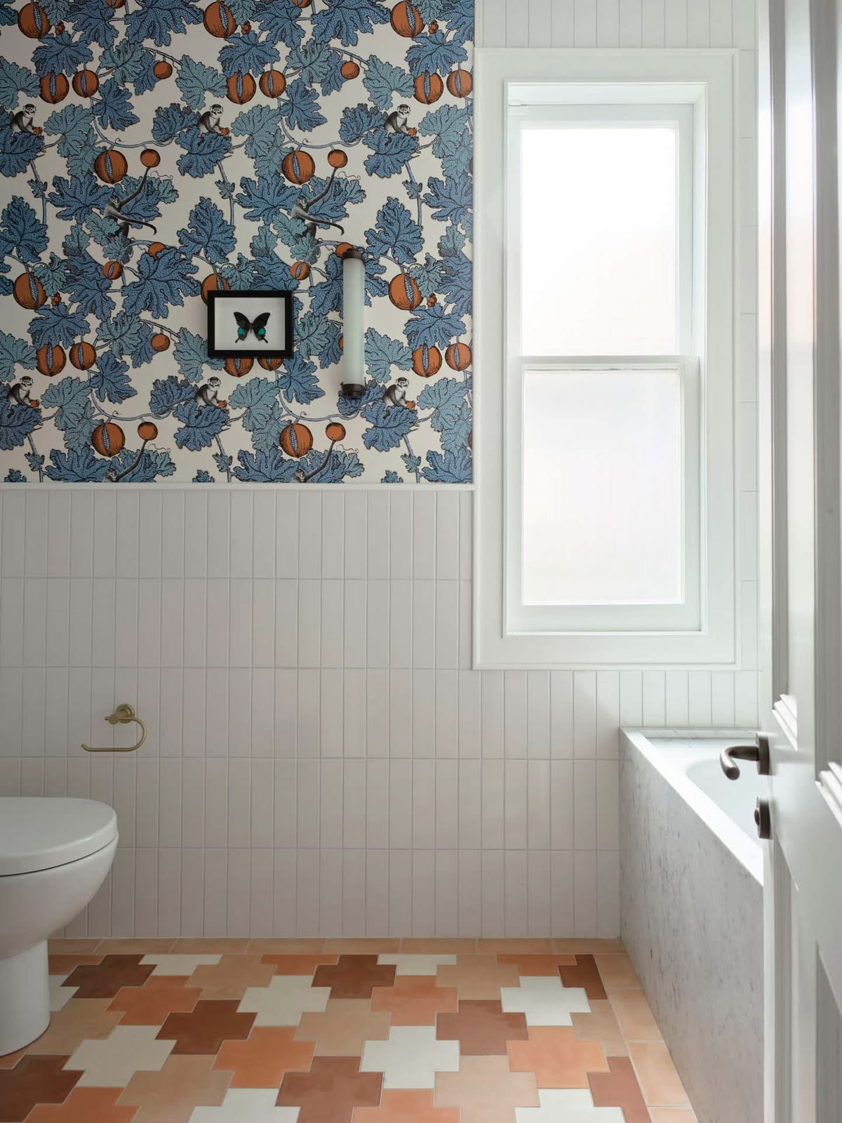
Wallpaper above, patchwork tile below, two patterns doing completely different jobs in the same small room.
One Statement, Given Room to Breathe
Occasionally a piece is bold enough to carry a wall on its own. When that happens, the instinct should be to give it space rather than compete with it. Below, a pictorial wallpaper is strong enough to be the whole scheme in this mudroom, and everything hung against it, brass hooks, a checked towel, is left deliberately plain.
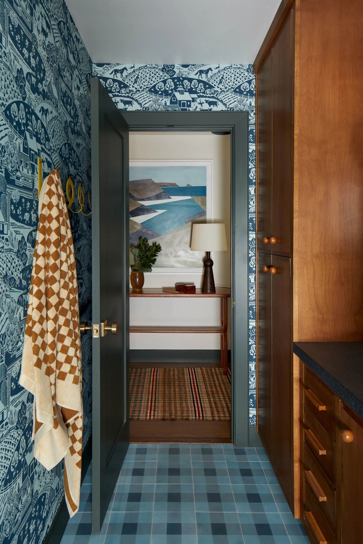
A pictorial wallpaper bold enough to be the whole scheme. Everything hung against it stays plain on purpose. Image via Architectural Digest.
When the Whole Room Commits
Sometimes the brief calls for more than restraint. These fabulous rooms go the other way entirely: a saturated wall colour, a heavily patterned sofa, layered cushions in a dozen different prints, and a piece of framed textile art holding it all together. This only works when every pattern in the room shares a colour family. Without that thread, the room can read as chaotic rather than confident.
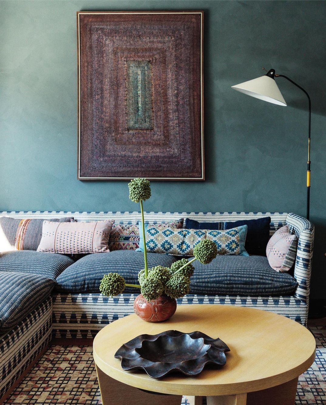
A dozen patterns, one teal thread running through the wall, the sofa, the rug and the framed textile above it. Image via Kelly Wearstler.
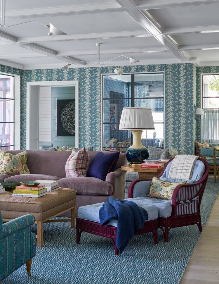
A palm-print wallpaper, plaid, floral and stripe all sitting comfortably together under one blue and white palette. Image via avreaandcompany.com
Neutral Doesn't Mean Boring
Neutral rooms with subtle pattern can work very successfully using texture and layers rather than colour. In this living room a striped ottoman provides the focal point, a scattering of subtle block-printed cushions and a coffee table dressed with woven baskets and terracotta can sit alongside leather ottomans and plain linen sofa make the room feel layered and interesting rather than bland and boring.
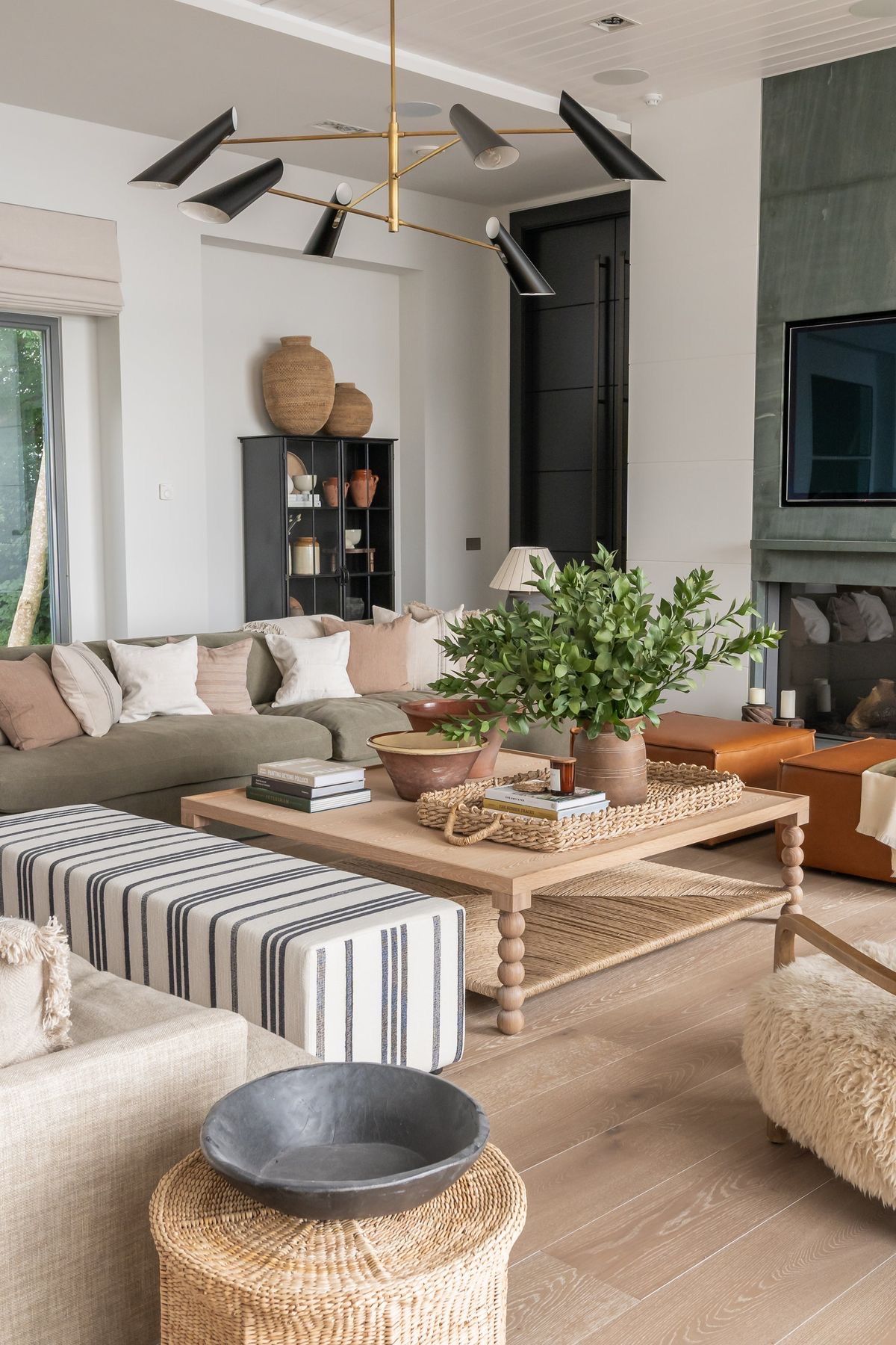
Woven baskets, a striped ottoman and terracotta glaze, pattern built from texture as much as print. Image via Pinterest.
One Colour, Many Patterns
The most reliable way to layer pattern with confidence is to stay within a single colour and let the patterns themselves vary. A room built entirely in tonal blue, or entirely in green, can carry a stripe, a leaf print and a woven texture all at once, because nothing has to compete for attention on colour. The eye reads it as one considered decision rather than several separate ones.
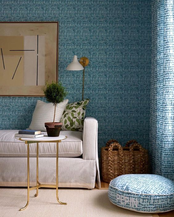
Wallpaper, curtain and floor cushion all in the same tonal blue weave, with a plain sofa left to anchor the room. Image via Pinterest.
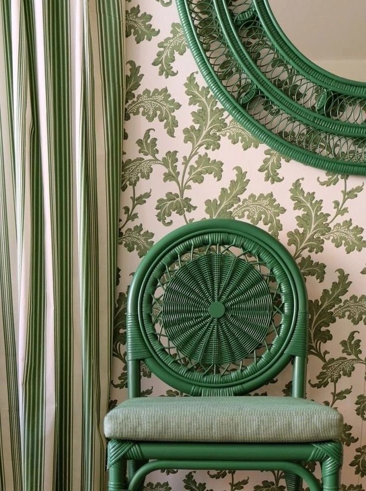
Leaf print, stripe and woven rattan, three different patterns held together by a single confident green. Image via Pinterest.
Knowing When to Stop
Just as important as knowing where to add pattern is knowing where to leave it out. A guest room with a beautiful statement bed, paired with a soft floral linen repeated on the comforter and bedside table frill, a pair of plain ceramic lamps, simple block printed bolster cushions and a subtle patterned rug. Pattern used generously, can be more considered than five patterns used sparingly. Restraint is not the absence of pattern. It's choosing exactly where it should be applied.
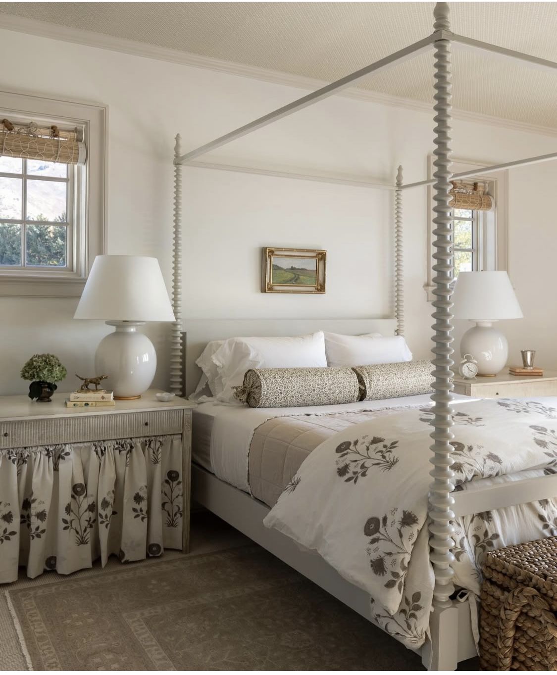
One pattern, used with confidence, and nothing else competing for the eye. Image via vanderwallinteriors.com

Ready to Bring Pattern Into Your Space?
Whether it's one considered layer or a full furnishing plan, our Design Edit and Signature Styling Experience packages help you build a scheme that feels collected, not curated.
Book a Consultation